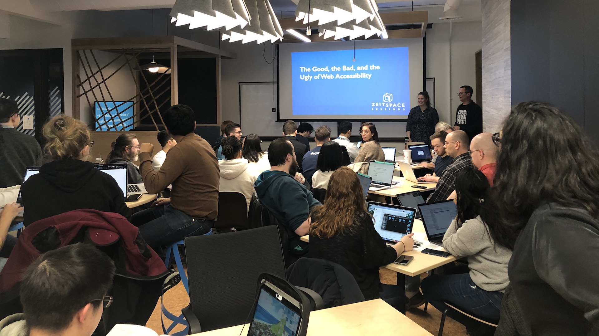
Making your web site accessible can be a daunting task. There are laws to be aware of and comply with, international standards to understand, and possibly even changes to make to your product development process. Our latest Zeitspace Session looked at the good, the bad, and the ugly of web accessibility and, if the energy and conversation in the cozy fireplace lounge is any metric, the local product development community is enthusiastic to make their web sites more usable through accessibility.
The session kicked off by exploring the rules around web accessibility. For most folks, this means the Accessibility for Ontarians with Disabilities Act (AODA) and Web Content Accessibility Guidelines (WCAG), an ISO standard developed by the World Wide Web Consortium (W3C). While the AODA encompasses more than just web content, it governs how Ontario companies of various sizes are required to make their web sites accessible relative to a particular set of WCAG guidelines (WCAG 2.0 Level AA).
There are several dates and responsibilities you should be aware of:
-
By the end of 2020, organizations with more than 20 employees must submit an accessibility compliance report which covers a variety of accessibility concerns, not just web content.
-
By January 2021, web sites for organizations that have more than 50 employees must meet AODA requirements which mandate WCAG 2.0 Level AA.
While expansive, WCAG does a good job at providing both practical and philosophical guidance for web accessibility. Those philosophical guidelines helped people who came out to our Zeitspace Session start thinking about different ways accessibility benefits everyone through different lenses: Is content perceivable? Is the site operable? Is the content and site understandable? Is the way the content is structured and described robust? You can remember these four WCAG principles using a POUR mnemonic (Perceivable, Operable, Understandable, Robust).
In the first activity of the session, participants looked at how accessible web sites are built up of larger blocks of related information: a site may have a navigation section, a banner, a footer, and a main block. By designing and developing with these larger blocks in mind, content becomes less fragmented and people using assistive technology like screen readers can quickly understand the basic structure of the page (allowing them to skip over sections or jump to a section of interest).
We provided participants with print outs of several web sites and asked them to draw big boxes around the content, labelling the sections according to the WCAG landmarks or HTML elements. (The source images for this activity are available on Zeitspace's GitHub repository.)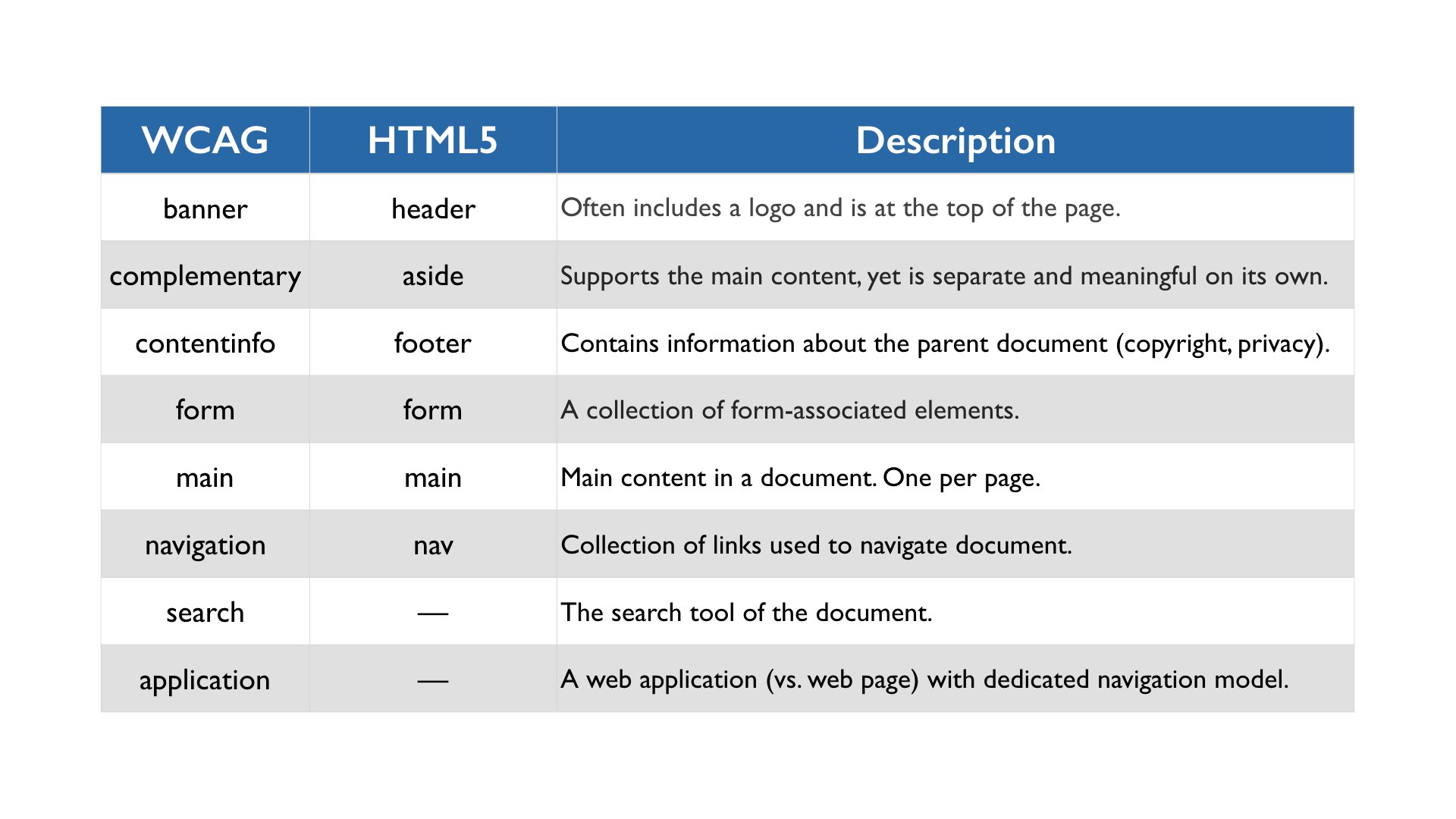 When designing and developing for accessibility, think about both the high level architecture and the low level implementation where gaps might exist. There are a lot of tools to help identify issues, but also help you familiarize yourself with WCAG and pre-existing patterns in your web sites (“Wow, we consistently miss setting the page language…”). Automated tools can be quite helpful to get a broad understanding of issues for a given site, but we recommend using more than one to mitigate bias and coverage limitations. One of those limitations is that not everything can be automated. You should always involve humans in exploring and testing for accessibility.
Zeitspace tries hard to bake accessibility into everything we do. But it was fun to create a web page for the second activity which contained a variety of accessibility shortcomings. Participants dove into Adobe XD design files, looked at the corresponding web page, and examined the HTML code. Using various methods — including some of the automated tools we’d introduced earlier — participants uncovered a wide range of issues and tied them back to the WCAG principles.
-
Text contrast errors. WCAG 2.0 Level AA requires body text to have a contrast ratio of 4.5:1, while larger text must have a contrast ratio of 3:1. Text should be perceivable and distinguishable from the background.
-
Image text errors. Setting alt attribute text for images allows, for example, screen readers to describe an image. Knowing how to write good alt text for images is not always straightforward, but there are good discussions on the topic.
-
Structural errors. Using semantically correct HTML5 will get you a long way to robust (there’s that WCAG principle again!) accessibility for web pages. For example, our activity page didn’t use header elements properly (which most folks who use screen readers depend on), and mixed
<p>and<br>elements. -
Multiple cues for navigation. The web page we explored was a news article with many links. Those links used colour as a visual cue for the reader that there was an action tied to the text. As part of the perceivable principle, navigation links should use more than one cue, such as both colour and underlining to increase its usability.
One of the better ways to ease into accessibility spelunking is to use a checklist like the one 18F provides. The 18F checklist distills WCAG 2.0, prioritizes key concerns, and guides readers in looking for common shortcomings. The online version of the checklist provides links to relevant WCAG sections with examples.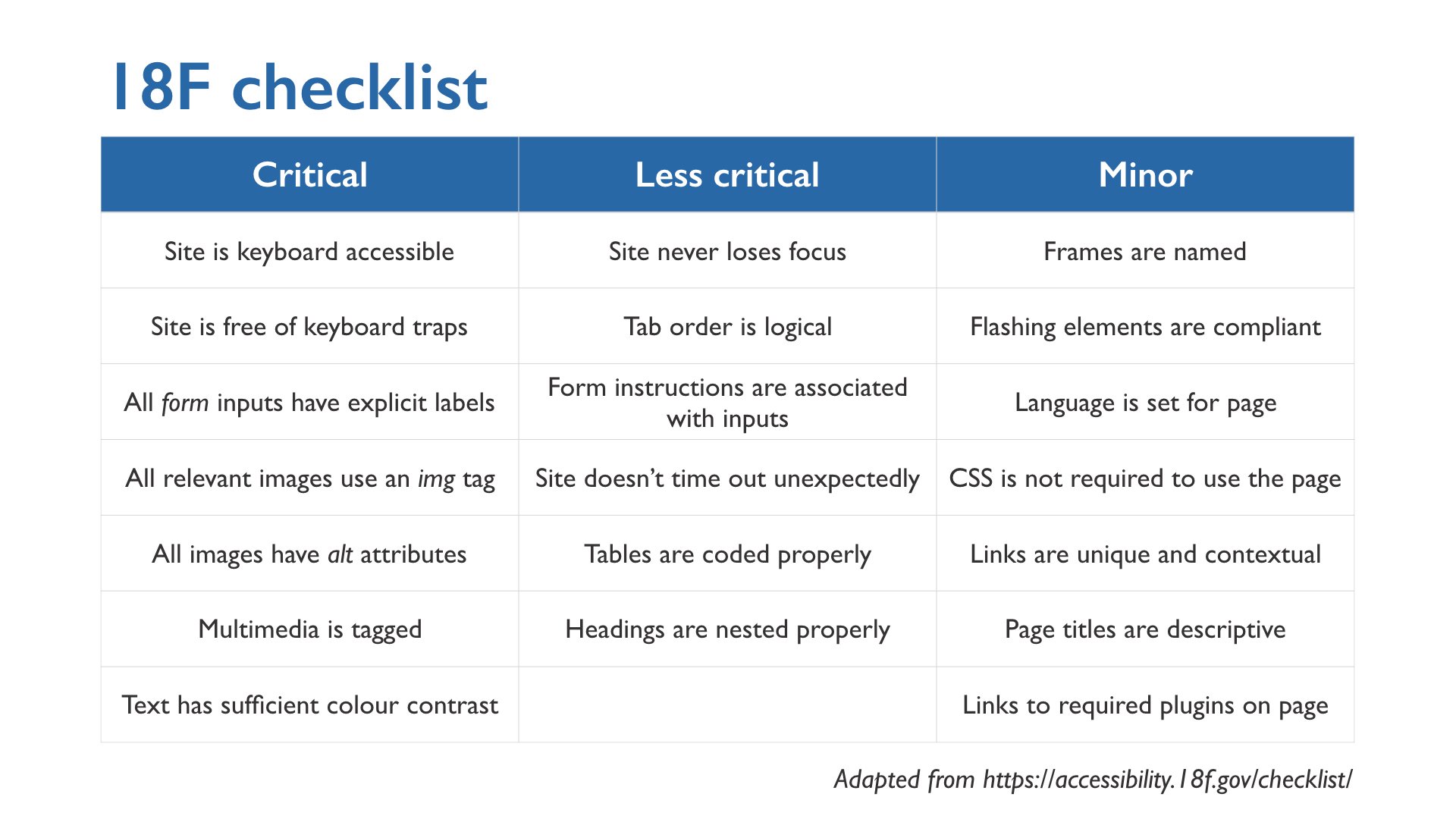
Mozilla defines accessibility as “the practice of making your websites as usable by as many people as possible.” Not surprisingly then, how we might test a web page for accessibility (relative to those four WCAG principles of perceivable, operable, understandable and robust) doesn’t deviate too much from how we test a web page for usability more broadly. As Sarah Richards said: “Accessibility is usability.”
In addition to following best practices for usability testing, consider the following situations:
-
When testing a web site’s accessibility, try to find people who use assistive technology (such as screen readers) or have experience with accessibility features.
-
If you’re testing with someone who has a visual impairment, be explicit about things you assume someone might notice. For example, ask if you can record the session (they might not see the video camera), or mention you’ll be taking notes (so they better understand the gaps in conversation while you write something down).
-
Consider going to them to test. This may not only help with transit time and inconvenience, but it will allow them to use their own equipment, making for a more representative test.
-
Ask dumb — not ignorant — questions. This is your chance to learn about accessibility issues and related workflows.
Learning that there is a law which requires web sites to be accessible may make you anxious. Looking at the scope of standards such as WCAG can be intimidating! There are tools and resources available to not only better understand your responsibilities, but incorporate designing and developing for accessibility into your product development workflow.
If you were unable to join us for this Zeitspace Session, don’t worry: we’ve shared all the slides, resources, and activities on GitHub. We encourage you to download them, try the activities with your team, and dig into the resources.