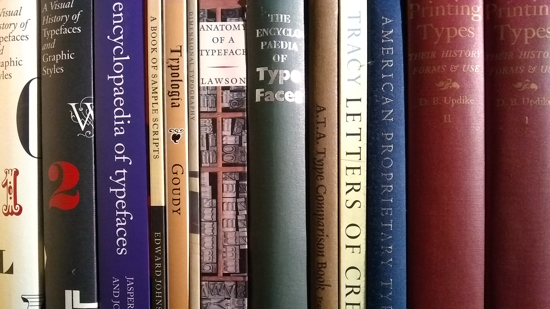
Imagine spending years investigating the fundamental building blocks of the universe. You and countless others have toiled away, spent billions placing superconducting magnets in tunnels beneath the Alps, and finally have the answers you’ve been searching for. You’re ready to share your findings.
As millions around the world wait anxiously, sitting on the edge of their collective seats, you show slide after slide of stunning results.
All using Comic Sans.

(The scientists at CERN shared the results of their search for the Higgs boson to a lecture hall full of people. Image courtesy of CERN)
While this is certainly the stuff of nightmares — at least for designers and typographers — this actually happened. In early July 2012, the scientists at CERN shared the results of their search for the Higgs boson using a font which has been widely ridiculed and considered inappropriate for anything other than primary schools handouts.
But why did this font choice get everyone so worked up? In short, there was a disconnect between the importance of the science and the perceived frivolity with which it was communicated — the tone or personality of the typography was too different from the message itself. It’s not what the CERN scientists said, but how they said it that drew backlash from some in the design community. Credibility, authority, and trust can be bolstered or diluted through design. But not all disconnects between content and its presentation are as public or as cringe-inducing.
Seb Lester, a calligrapher and lettering artist, gained attention several years ago when he shared photos of his grocery lists, beautifully written in ‘copperplate’. In an interview with Uppercase magazine in 2014, Lester claimed his work “juxtaposes modern sentiments, ideas, and language with ancient craftsmanship.” In this case, the contrast between the timeless beauty of an ornate and increasingly rare script and something as pedestrian and ephemeral as a grocery list made people stop and pay attention.

(A grocery list written on the back of an envelope in calligraphy.)
These are examples of obvious dissonance — you can’t help but react to the difference in type and content. But what happens when the contrast is not so obvious? How do we process the message differently when the type isn’t front and centre?
In 2012, Errol Morris, a filmmaker, writer, and contributor to the New York Times, conducted an experiment. He wrote an essay, framed as an exercise to see if readers were optimistic or pessimistic, and shared it on the New York Times website. Readers were (unknowingly) shown the essay in one of six randomly chosen typefaces: Baskerville, Georgia, Computer Modern, Helvetica, Comic Sans (there it is again!), or Trebuchet (all shown below, in order from top to bottom) .

After reading the essay, visitors were asked two questions: Did you believe the key claim of the essay? How confident are you in your belief?
Morris was trying to determine (unscientifically) if different fonts were considered more trustworthy than others. In other words, did the font used to present information influence the reader’s ability to assess its truth?
In a word, yes. People who read the article in Baskerville were about 1.5% more likely to trust the content. Michael Beirut, an influential graphic designer, uses this experiment to wonderfully relate typefaces to voices: “In a way, typefaces are the graphic equivalent of the human voice, and each voice has a specific timbre and accent. In my mind, Baskerville speaks with a calm, confidence-inspiring English accent, sort of like Colin Firth. No wonder it’s so trustworthy.” Comic Sans, unsurprisingly, was considered the least trustworthy.
These three stories illustrate just how powerful type can be and how important a decision designers are making when they choose typefaces. Ask 10 designers how to approach type selection for a given situation and you’re likely to get 11 different answers — the relationship between designers and typography is that complex.
In 1932 Beatrice Warde — writing as Paul Beaujon so that the male-dominated industry would actually read her words — wrote an essay entitled The Crystal Goblet, or Printing Should Be Invisible. She suggested that typography should be like a crystal wine goblet, and should “reveal rather than hide the beautiful thing it was meant to contain.” She felt the type shouldn’t affect the message any more than absolutely necessary — the typography should be invisible.
The theme of transparent typography isn’t unique, even if it isn’t universally accepted. Robert Bringhurst, a typographer and author of the seminal The Elements of Typographic Style, felt that “…typography must often draw attention to itself before it will be read. Yet in order to be read, it must relinquish the attention it has drawn. Typography with anything to say therefore aspires to a kind of statuesque transparency.”
But is typography — layout and font choice, specifically — relegated to grabbing a reader’s attention and then fading away? Perhaps framing its contribution as a supporting role is more appropriate. Its strength lies in its ability to supplement the goals of the communication: Good typography helps readers connect with the message.
Let’s face it: there are a lot of fonts out there — some of them are even good! Knowing how readers will react to a given font is important. A designer needs to understand the personalities of the fonts at their disposal. To do that, we need to know how to describe and relate to letterform design itself, and understand why some designs evoke certain emotional responses.
The language of typography is rife with fingerprints of its human creators: The spine of an ’s’; the leg of a ‘k’; the ear of a ‘g’, and so on. This anthropomorphism extends beyond the shape of letterforms.

Designers often talk about fonts as if they were individuals, each with unique personalities and physicality. In 2004, graphic designer Ellen Lupton claimed Helvetica, the sans serif typeface synonymous with Swiss modernism, “isn’t fat…she just has big bones” while Mrs. Eaves, a throwback serif typeface with a decidedly modest x-height, is described as having a “low waist and a small body.”

Unfortunately, as colourful as the language of typography is, it is at least as imprecise and subjective. (And sometimes it’s just wrong. Why do we refer to fonts as masculine or feminine? Or, worse yet, as sexy?) In Why Fonts Matter, graphic designer Sarah Hyndman provided an approachable introduction to why talking about, measuring, and understanding our reaction to type can be complicated.
Hyndman described how our personal exposure to advertising, branding, and mass media ties fonts or font styles to values. We may associate a fancy script font (like Seb Lester’s calligraphy) with elegance and high cost because we’ve seen such scripts on fancy, expensive things. We may associate Helvetica with utility and simplicity because we’ve seen it used with minimalist product designs (think of the No Name branding in Canada). These associations play out in ways that can reinforce a message (Helvetica’s blandness works well with the low-cost, anti-branding of No Name products), or they can call attention to the contrast between the message and the type (a delicate script on a can of budget peach slices might confuse or annoy shoppers).

(Cans of lentils and peach slices, a bottle of apple cider and a jar of marinated artichoke hearts are lined up on a kitchen counter.)
In the practical and entertaining Stop Stealing Sheep and find out how type works, Erik Spiekermann and E.M. Ginger wrote: “We associate particular typeface looks with certain products. Fresh produce always seems to want an improvised, handwritten sort of message, while high-tech applications demand a cool, technocratic look. Warm, cuddly products respond to a soft serif treatment, grainy whole foods are represented best by a handmade, rough-edged typeface, and serious money businesses always recall the era of copperplate engraving, when assets were embodied in elaborately printed certificates.”
But not all influences on our reactions are as obvious as advertising. For example, the human brain still interprets sharp, jagged shapes as more dangerous than rounded ones; our threat response, processed by the amygdala in our brain, is still alive and well (and, because of it, so are we). Angular letterforms with sharp corners are often perceived as unfriendly or impersonal because of this response.

We also need to consider cultural and personal influences. Where and when we grew up can influence how we relate to type in the world for the rest of our lives. The past frames how we interpret type today and may interpret it tomorrow.
Of course designers can’t possibly know everything that influences an individual reader’s reaction to a message and its typography. But understanding the key elements that play a role can improve communication design:
- the connotational baggage of certain styles of type (e.g., Blackletter, ‘Western’, historical scripts, etc.)
- the balance between using type to attract attention and playing a supporting role to the message itself
- the psychology and mechanics of reading (which largely inform the core tenets of typographic design)
- personal and societal associations (which can be explored through design research)
Type is powerful. It can influence how others value our school assignments, who wins an election, or how we interpret a metal band’s logo.
But type is not a one trick pony. It can scream or whisper. It can comfort or enrage. It can bolster or dilute. It can convince or discourage. And like the slides from those scientists at CERN, type can build trust or break it down. As designers, we should be deliberate with our choice of type and respect the influence it can have on the reader.

