Any developer who’s had to work on a cross-platform mobile app knows the struggle of keeping the features and experience consistent across each platform. A variety of tech companies have already developed frameworks that tried to tackle this problem. But the new kid on the block, Flutter, promises to make cross-platform development easier than ever. During our latest Zeitspace Session we explored how to get started with Flutter, and some of its benefits while building a simple to-do app.
Why Flutter?
Many teams have tried to tackle cross-platform app development, so what makes Flutter different? Flutter’s main advantage is how Flutter interacts with your device. Early frameworks like Ionic built apps using HTML and JavaScript running in a WebView, essentially displaying a local webpage as if it were an app. They would then use a code “bridge” to access system services like location, storage, or Bluetooth. Newer frameworks like React Native use a bridge not just for accessing services but for building a user interface (UI) out of platform-specific widgets as well. Additionally, both of these types of frameworks only use JavaScript which needs to be interpreted at runtime.
Flutter, on the other hand, uses a custom rendering engine. This lets Flutter create its own widgets and quickly render them on any supported platform. It also uses the Dart programming language which can be Ahead-Of-Time (AOT) compiled to native iOS or Android code. This eliminates any need for a bridge and offers better performance than the interpreted code of JavaScript-dependent frameworks. Dart also has a number of other features which further improve the performance of Flutter apps.
The Flutter team also focuses on the developer experience. The Dart programming language can be Just-In-Time (JIT) compiled, which means that during development an app can be updated with new changes in less than a second, significantly reducing development time. Plus, Flutter comes packaged with a number of developer tools for UI inspecting, memory and performance monitoring, and debugging.
Building an app
During our recent Zeitspace Session we guided participants through creating a simple to-do app with some basic styling. The first thing you learn when developing Flutter apps is that everything is a widget. Buttons, images, and text are all represented using Flutter widgets. Widgets can also be composed of other widgets, letting us create layouts, and more complex custom widgets.
In the Zeitspace Session we saw how Flutter uses these widgets to create UIs. In Flutter each widget has a specific area of responsibility. Some handle displaying content (e.g., Text, Icon, Image), some handle layout (e.g., Center, Container, Column), some handle user interaction (e.g., CustomScrollView, GestureDetector, Draggable), and others combine some of these areas (e.g., Scaffold, Checkbox, AppBar). These widgets all have properties which let you change their appearance, like colour or size. Many of these widgets also have a child or children property, which lets you provide other widgets who are children of that widget. For example, a “Center” widget can take a “Text” widget (or any other widget) as a child. The “Center” widget then centres its child widget within the display. Using a series of widgets with other widgets creates a widget tree, which lets the developer see the structure of their UI, and lets Flutter easily render all the widgets to the display.
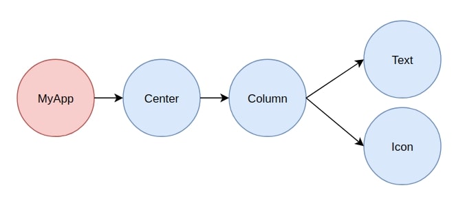
To demonstrate this, let's look at a simple layout of some centred text and an icon. Our example is displayed like this:

This is the widget tree for the layout above:
And this is the code for the layout:
| Center( child: Column( children: [ Text("Hello World!"), Icon(Icons.cake, color: Colors.blue), ], mainAxisAlignment: MainAxisAlignment.center, ), ); |
In the code you can see how the “Center”, “Column”, “Text”, and “Icon” widgets are arranged to define the widget tree. The “Center” widget has the “Column” widget as its child, and the “Column” widget has both the “Text” and “Icon” widget as its children. We also make use of some other properties of these widgets to add some styling. We set the colour of the “Icon” widget using its “color” property, and we centre the children of the “Column” widget along its main (i.e., vertical) axis using its “mainAxisAlignment” property.
All UIs and layouts in Flutter are simply more complex versions of these basic ideas. The structure of the UI is defined by the widget tree, and we modify the appearance and function of the widgets using their properties.
We can also combine widgets to create new complex widgets like we did with our “TodoTile” widget during the Zeitspace Session.

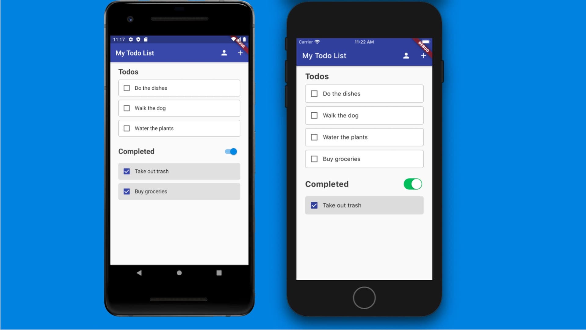
The TodoTile widget in the to do (left) or complete (right) state.
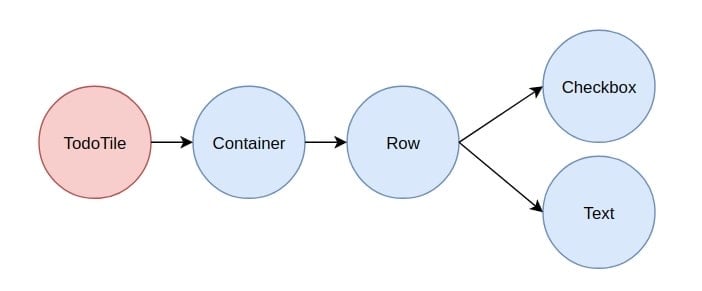
The widget tree for the TodoTile widget.
This “TodoTile” widget was rendered with the following code:
|
Widget build(BuildContext context) {
return Container ( child: Row( children: [ Checkbox( activeColor: Theme.of(context).primaryColor, value: isDone, onChanged: (bool newVal) => toggle(context, newVal, index),
), Text( name, style: TextStyle(fontSize: 16), ), ], ), decoration: BoxDecoration( color: isDone ? Colors.grey[300] : Colors.white, border: Border.all( color: isDone ? Colors.grey[300] : Colors.grey[400], ), borderRadius: BorderRadius.all( Radius.circle(5), ), ), margin: EdgeInsets.only(bottom: 10), ); } |
Looking at the widget tree diagram we can see that the TodoTile widget’s structure is very similar to our first layout. But here we see some more features of common widgets. The “Container” widget is a very common widget which is incredibly useful for styling and laying out more functional widgets. In this example we add a margin to our tile using the “margin” property, and we add styling to it using the “decoration” property. To define the decoration we use a “BoxDecoration” widget which has properties like “color” and “border” along with many other useful properties for styling. We also use conditional expressions with some of these properties to change the style of the tile based on whether “isDone” is true or false.
Another feature we see in this example is the functional nature of some widgets. The “Checkbox” widget from the example has a property called “onChanged”. This property takes a function which is called with the checkboxes new value whenever the user toggles it. Many complex widgets like “Checkbox” or “RaisedButton” have functional properties to handle user interaction. There are also widgets like “GestureDetector” whose area of responsibility is purely functional; in this case detecting taps and gestures from users. These more specific widgets like “GestureDetector” allow you to have finer control over the widgets you create. And if you find that you can’t find the functionality that you want in a widget provided by Flutter, you have access to lower layers of functionality and the source for all the stock widgets. Using this you can create your own widgets from scratch the same way the Flutter team does.
Want to see more Flutter?
Well you’re in luck. There are lots of resources for Flutter, and more are created every day. There’s Flutter codelabs, a series by the Flutter team that guides you through creating a variety of simple Flutter apps. There’s also the Flutter in Focus YouTube playlist, which introduces key concepts in easily digestible videos, and explains some of Flutter’s inner workings. Of course you can also build the to-do app from our latest Zeitspace Session, which has its own github repo. The repo also has links to many other excellent Flutter resources. These include code examples, tutorials, and guides on transitioning from other platforms. Now that you have the basics down, keep building your Flutter repertoire and see how easy cross-platform app development can be.
We love sharing what we learn through Zeitspace Sessions. Sign up to get the inside scoop on our next one.


