
There are many challenges Product Managers navigate on a day-to-day basis. Feedback and input from multiple sources all delivered with the same level of passion and urgency may be one of the trickier ones.
For anyone with a fast growing product, the following may sound eerily familiar. Support is fielding the same issue from multiple, angry and frustrated customers. The VP of Sales is telling you that competitors are demoing a killer feature you don’t have yet and now their pipeline is in jeopardy, and she not so subtly suggests it’s your fault. Online reviews are riddled with users complaining about UX issues and incomplete features. Engineering has suggestions to improve product responsiveness while reducing hosting costs and they’d like to update the JS framework they’re using. Last but not least, win/loss analysis has given you a laundry list of improvements that should help reduce churn. Just another day at the office for Product.
The opportunity costs of what else the development team could be doing weigh heavy on your mind but you obviously want to improve the product. Worse yet, you have a laundry list of passionate opinions to sift through with sparse amounts of supporting data. One thing is for sure — everyone is certain that what they need has to happen next or:
- sales will evaporate
- customers will churn
- the CX team will quit
- your hosting costs will continue to soar while the experience of your product degrades
There are many ways you could approach this all too common scenario and in some cases, particularly in heavily roadmap driven organizations, feedback is just ignored. And while that’s an option, it’s obviously not a great one and most product managers will choose to at least inform their prioritization based on feedback.
The challenge is to get everyone on the same page about the importance, effort, and impact of the things coming to light through your feedback loops. To accomplish this, I use a simple Google Sheet with columns that capture a brief description of the issue, the source of the feedback and the impact. So specifically:
- What’s happening from the user’s perspective. Links to screen recordings are great for this. Wherever possible try to specify the user type/personas affected as it helps with context.
- T-shirt size level of effort: what will it take from design and engineering to remedy the issue on a relative bix (S, M, L). We’re looking for relative effort here not specific estimates and commitments from design and engineering.
- The frequency of the issue: does it affect all users or just some? Does it happen hourly? daily? weekly? etc…
- User value: if we make this change, what is the positive impact on our users? Low, medium or high or scale of 0–10 or whatever works for you and your team. Just be consistent.
- Key metric: if we fix this, what outcome do we expect (e.g. increase revenue by $250K, reduce churn by 3%, reduce support tickets by 20%, close Big Company X deal for $150K ARR)? Be as specific.
- Reporter/Source (e.g. CX, direct from a customer, etc…) in case we need to get more info or want to follow-up as part of our product discovery.
- If you have some form of mapping (e.g. journey map, story map, experience map), identify the stage(s) to give everyone additional context and to describe the user and their goals further.
Yep I know that’s a lot of information but I suggest you capture as much information and context as possible about the issues you’re evaluating. It’s well worth the effort to be as detailed and explicit as possible so you’re all working from the same page. Also, when I do this, I’m looking for commitments form the respective stakeholder on how resolving each item is going to move the needle and by how much. Both of which are essential in the next step.
Next, I call a meeting and work with the team that represents the stakeholders, and we plot each issue with the X-axis as User Value from low to high and Level of Effort from Large to Small on the Y-Axis. Yeah, it’s backward but hey, you gotta have your prime quadrant high-and-to-the-right or it confuses people.
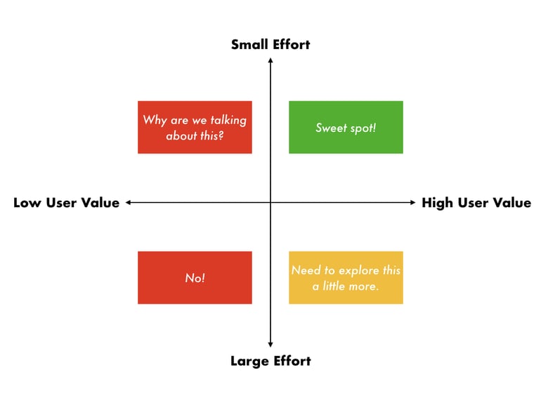
This gives us 4 quadrants. Obviously, no one wants to spend time on low-value items but getting buy-in is crucial in product management so you’re not wasting your time at all by having transparent discussions and decision making. To the contrary, you and the entire team are benefiting from it by having a shared context and input to the decision making.
With collective agreement not to work on the low-value items out of the way, I focus the team on the high-value, small effort quadrant as our sweet spot to tackle as it’s a proxy for our engineering ROI. I don’t summarily dismiss the high-value, large effort tasks but instead, I suggest we dig into these a little more and then revisit them at a later date. In both high-value cases, you should place these items in your product discovery queue and take them to the backlog however you normally would. Don’t skip steps.
This tool is also useful to communicate with the entire company as to why we’re tackling some things and not others. And if someone disagrees with how we classified something, we have a conversation about why they feel the user impact is greater or the effort is less and can choose to reopen the discussion.
Too often Product is viewed as a decision making, black box that makes whimsical decisions at will. The beauty of this simple approach is that it’s quick, it spurs discussion, often really great discussion, and gets buy-in from everyone.
Not sure if you're building products that people care about or are willing to pay for? Check out our guide to product validation to learn how to risk your next project.